Movio

A research-driven ticket booking experience designed to reduce friction, support accessibility needs, and streamline seat selection and checkout.

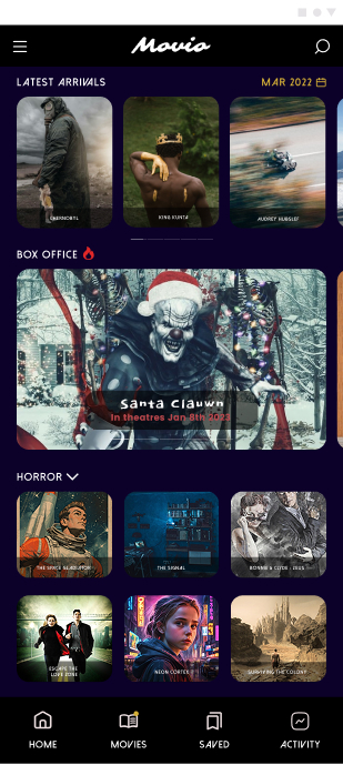
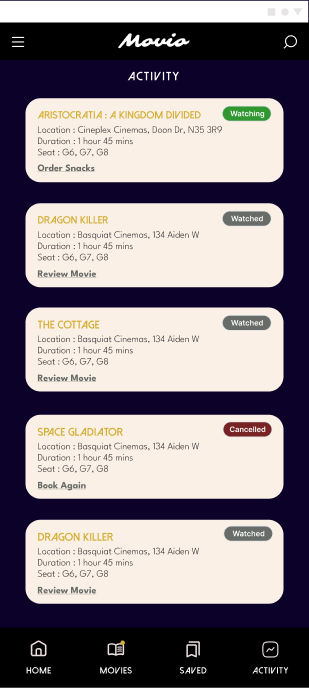
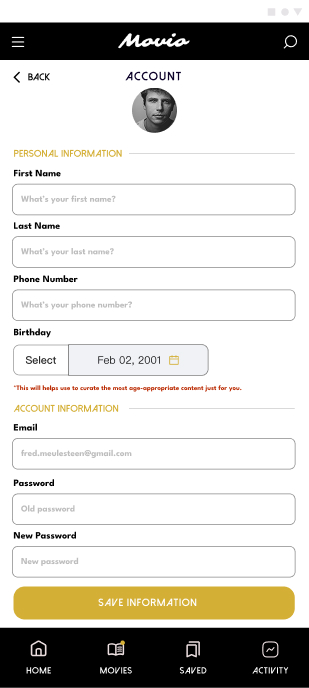
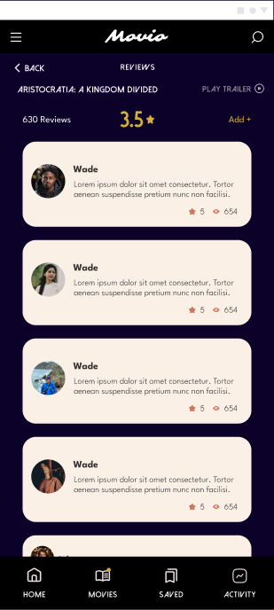
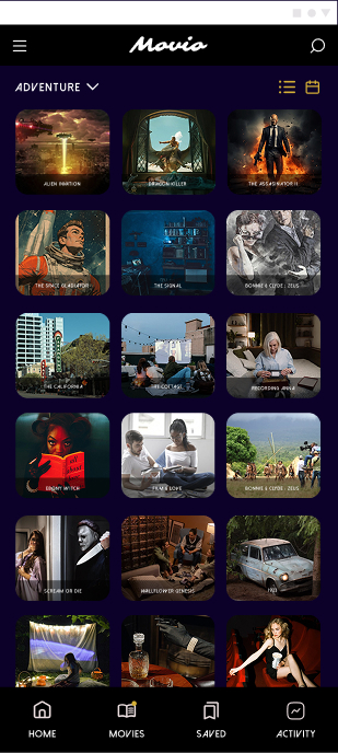
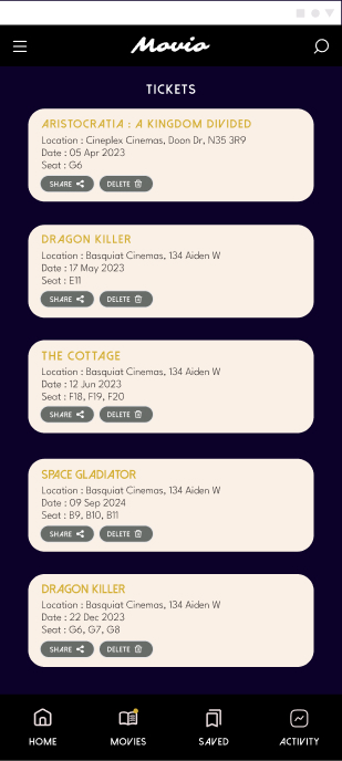
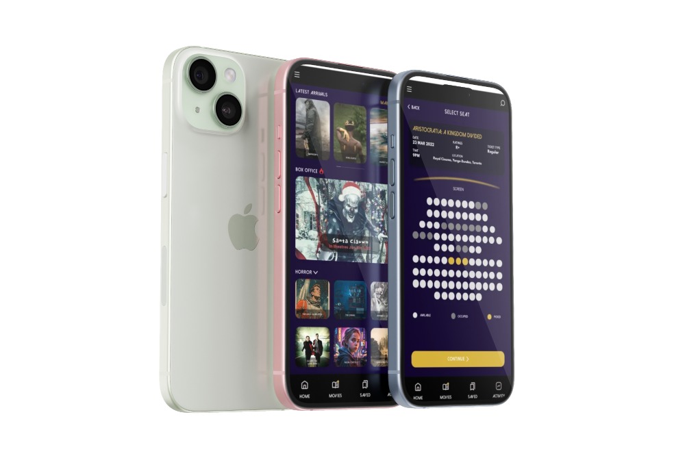
Movio is a mobile movie ticket booking app designed to simplify the end-to-end cinema experience — from discovering movies to reserving seats, pre-ordering snacks, and accessing tickets digitally.


Timeframe

6 weeks

My Role

UX Designer

Scope

End-to-end UX case study

Responsibility

Defining the product value proposition
Conducting competitive analysis
Planning and running a usability study
Translating research insights into UX decisions
Designing key user flows and interaction patterns

The Problem

Booking movie tickets can be unnecessarily time-consuming and stressful, especially for:

  • Users booking for groups.

  • Users with accessibility needs.

  • Users who want to reserve specific seat types in advance.

Existing platforms often introduce friction through:

  • Confusing booking flows.

  • Late or unclear authentication requirements.

  • Poor seat selection experiences.

  • Inconsistent accessibility support.

The challenge was to design a booking experience that is fast, predictable, and inclusive, while still supporting complex needs like seat types, snacks, and advanced reservations.
Goals & Success Criteria

User Goals

  • Quickly find and book movies for single or group visits.

  • Confidently select preferred seats in advance.

  • Complete checkout without unnecessary steps or confusion.

Business Goals

  • Reduce queue dependency at physical theatres.

  • Increase advanced bookings and snack add-ons.

  • Improve overall booking conversion.

Success Metrics (Defined for Testing)

  • Time on task (booking completion speed).

  • Task success rate.

  • Error frequency during booking and checkout.

  • System Usability Scale (SUS) feedback.

Research & Discovery

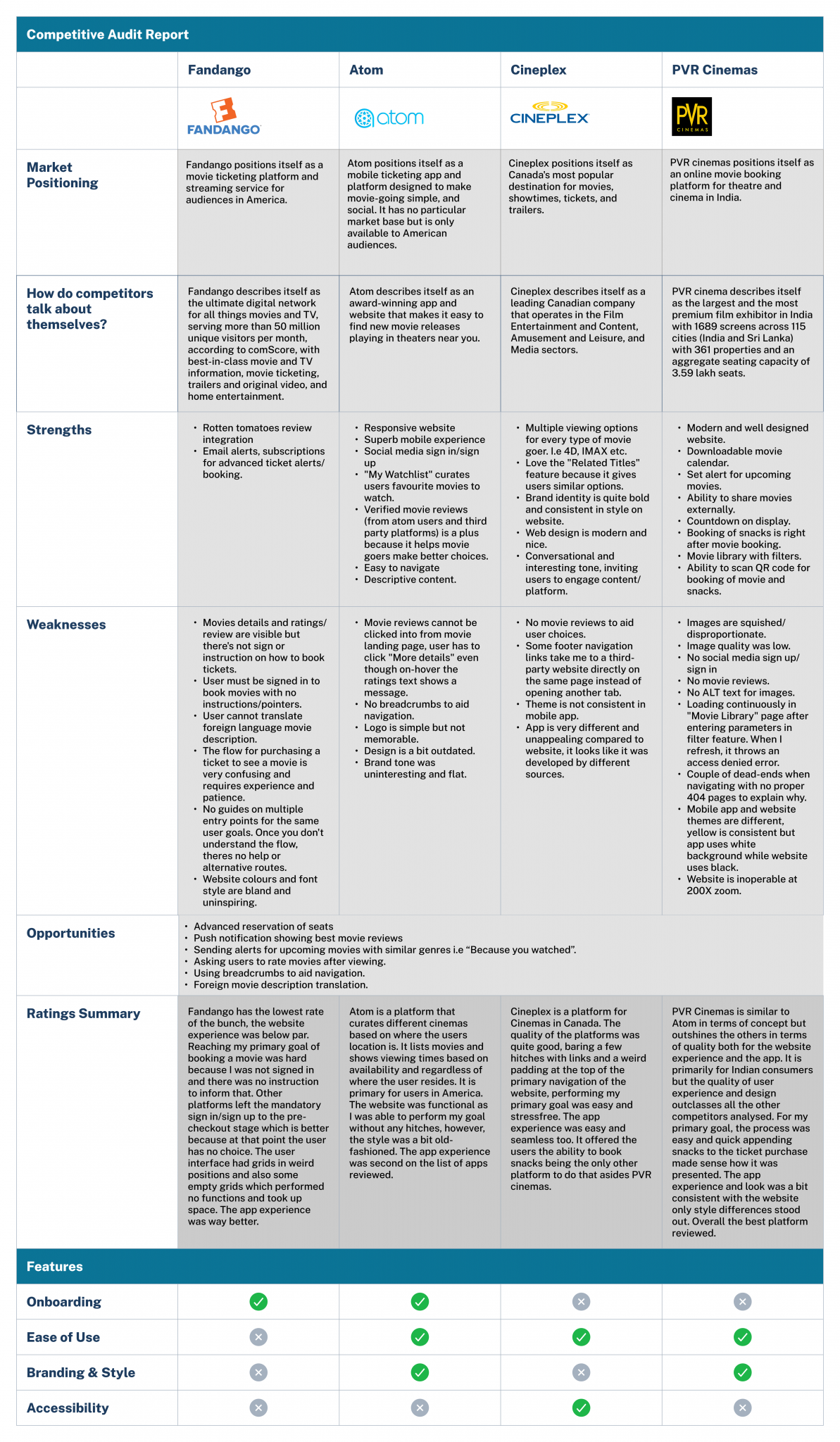
Competitive Audit

I evaluated major movie booking platforms to understand industry standards and gaps, including:

  • Cineplex

  • PVR Cinemas

  • Atom

  • Fandango

Key Findings

  • Strong platforms delayed sign-in until late in the flow

  • Poor platforms introduced confusion early and lacked guidance

  • Seat selection and snack add-ons were critical differentiators

  • Accessibility and consistency were often overlooked

Design takeaway:

A clear, guided booking flow matters more than feature volume.

User Research Plan

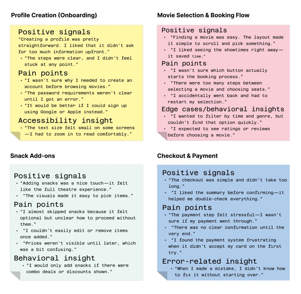
An unmoderated usability study was designed to validate booking flows and identify friction points.

Participants

  • 7 users, ages 18–65

  • Mix of abilities, including:

    • Visual impairment

    • Auditory impairment

    • Assistive technology usage

    • Non-native English speakers

Key tasks tested

  • Creating a profile

  • Booking a movie

  • Selecting seats and snacks

  • Completing checkout


Key Insights

 
  • Users expect seat selection to be visual, immediate, and reversible

  • Long or unclear checkout flows increase hesitation

  • Advanced snack ordering is seen as a convenience, not a luxury

  • Accessibility considerations significantly improve confidence for older users

These insights directly informed interaction and flow decisions.

Time on Task & Efficiency

  • “It took longer than I expected to complete the booking.”
  • “Too many steps made the process feel slow.”
  • “Once I understood the flow, it became faster—but the first time was confusing.”

Overall Usability Perception (SUS-aligned feedback)

  • Positive themes

    • “I think I’d use this app Movie if it saved my preferences.”
    • “Most of the app felt easy to use after a bit of exploration.”
    • “I felt confident completing the booking by the end.”

    Negative themes

    • “The app felt a bit inconsistent—some buttons behaved differently.”
    • “I’d probably need help the first time I use it.”
    • “There’s a learning curve—it’s not instantly intuitive.”

Key Emerging Insight Themes 

    • Onboarding friction: Users question mandatory account creation before exploration.
    • Navigation clarity issues: Unclear CTAs and multi-step booking create confusion.
    • Checkout anxiety: Lack of feedback and error recovery reduces trust.
    • Optional features causing friction: Snack selection interrupts flow rather than enhancing it.
    • Accessibility gaps: Text readability and clarity need improvement.
    • Learning curve vs. efficiency: First-time experience is confusing, but improves with familiarity.

Low-Fidelity Exploration

Purpose

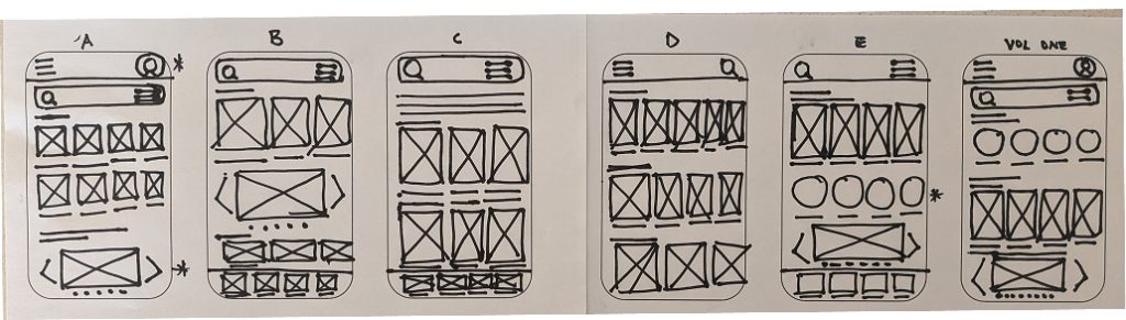
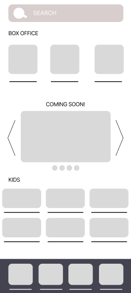
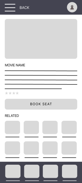
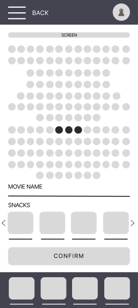
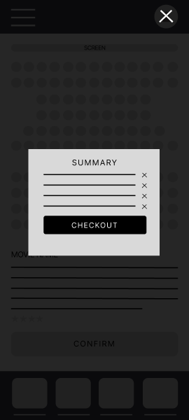
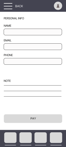
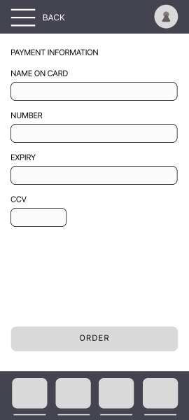
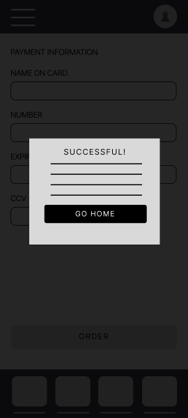
Before moving into visual design, I created low-fidelity wireframes to explore layout, hierarchy, and flow logic without visual distraction.

What I Focused On

  • Booking flow clarity
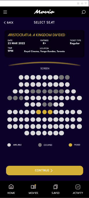
  • Seat selection layout and orientation
  • Reducing steps in checkout
  • Placement of optional add-ons (snacks)
 
I started designing on paper to quickly express my thoughts visually. I experimented with the landing page and got feedback from potential users.
Paper based design

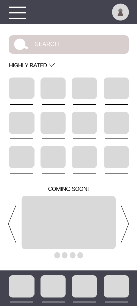
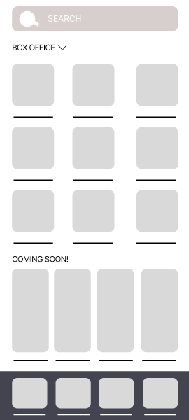
Digital based lo-fi

I then moved to low fidelity designs within the proper parameters of phone screens.

Core User Flow Definition

Using insights from research and lo-fi exploration, I finalized the primary booking flow:

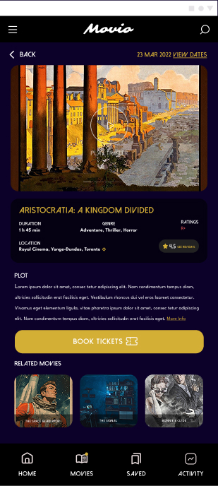
      1. Discover movie
      2. Select showtime
      3. Choose seats visually
      4. Add snacks (optional)
      5. Checkout & payment
      6. Access QR-code ticket

High-Fidelity Design

Visual & Interaction Design Goals

  • Make seat selection intuitive at a glance
  • Use clear hierarchy for high-risk decisions (payment, seat confirmation)
  • Ensure accessibility through contrast, spacing, and readable typography

Interactive Prototype & Validation

Prototype Overview

I created an interactive Figma prototype to simulate the complete booking experience, allowing users to move through the flow as they would in a real application.

What the Prototype Helped Validate

  • Flow clarity from discovery to checkout
  • Ease of seat selection and revision
  • Confidence during payment and confirmation

Outcome (Expected Impact)

Based on identified usability issues and design improvements:

    • Faster booking completion time
    • Reduced cognitive load during navigation
    • Lower drop-off rates in booking flow
    • Increased user confidence during checkout
    • Improved first-time usability

Opportunities (Future Enhancements)

Based on competitive gaps:

  • Personalized recommendations (“Because you watched…”)
  • Push notifications for movie releases
  • Review integration for better decision-making
  • Multi-language support for global audiences

Reflection

This project highlighted that:

  • Clarity is more important than feature richness
  • Poor flow design—not lack of features—is the biggest usability barrier
  • Small friction points compound into major drop-offs

If I were to iterate further:

  • Conduct usability testing to validate flow improvements
  • Measure conversion rates and task success
  • Optimize for accessibility and edge cases