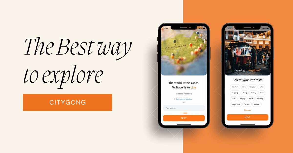
CityGong is a mobile app that helps new city arrivals (tourists, students, social explorers) discover curated experiences, events, and places that match their interests — going beyond common tourist recommendations and word-of-mouth suggestions.
A discovery-first experience focused on personalization, simplicity, and fast decision-making, replacing cluttered search with curated recommendations.
This case study showcases my approach to reducing friction in experience discovery through research-informed design, simplified navigation, and personalized recommendations.
Timeframe
3 Months
My Role
Lead UX/UI Designer
Tools
Figma, FigJam, Photoshop, Illustrator, Usability testing
Services
UX Research
Interaction Design
Usability Testing
UI Design & Prototyping
The Problem
Many users arriving in a new city struggle to find meaningful experiences — not because they aren’t available, but because the search experience is fragmented, overwhelming, and relies on word-of-mouth or large generic platforms.
Users needed:
Intuitive discovery of activities
Recommendations tailored to personal tastes
Fewer barriers to find and act on suggested activities
Goal and Success Metrics
This project aimed to simplify exploration and make it more enjoyable and efficient.
Primary goal:
Help users discover meaningful experiences in a new city quickly and with confidence.
Target success metrics (design validation):
≥ 80% task completion rate for core actions in prototype usability tests
≤ 3 steps to find and save an experience
≥ 4.0 / 5.0 average satisfaction score from usability feedback
These metrics help show measurable success during prototype validation even before full development.
Research & Key Insights
I conducted a mixed research process consisting of:
Secondary research on existing exploration products
Primary interviews with 5 potential users (17–45 age group, tourists and local explorers)
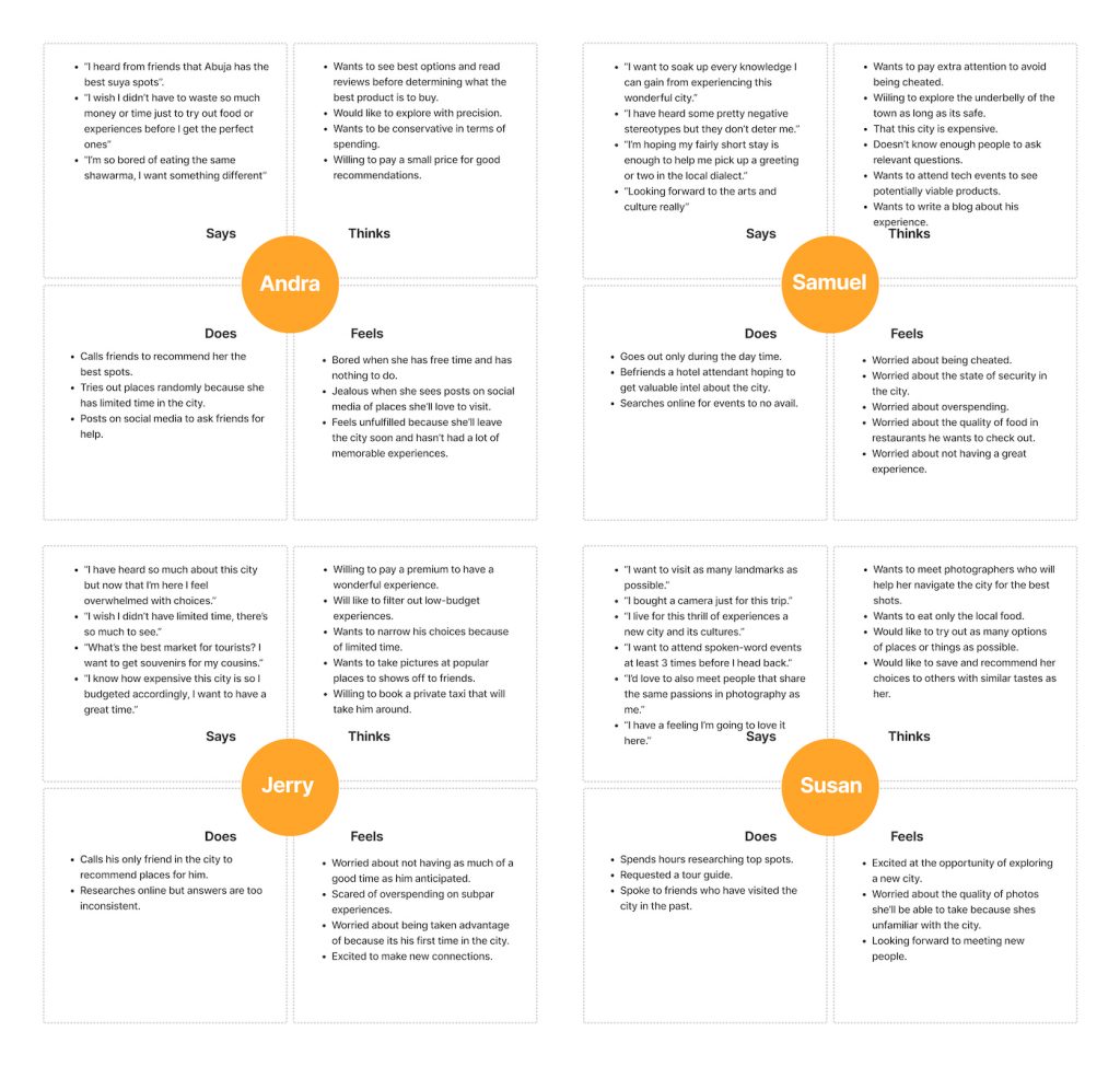
Empathy mapping to understand underlying motivations
Key insights
Users want curiosity and novelty in discovery.
Connectedness — recommendations feel more reliable when socially validated.
People prefer visual, intuitive browsing over text search.
Users prioritize experiences that fit their time, budget, and mood.
These insights directly influenced the design of the discovery flow and the feature prioritization.
Competitive & Heuristic Analysis
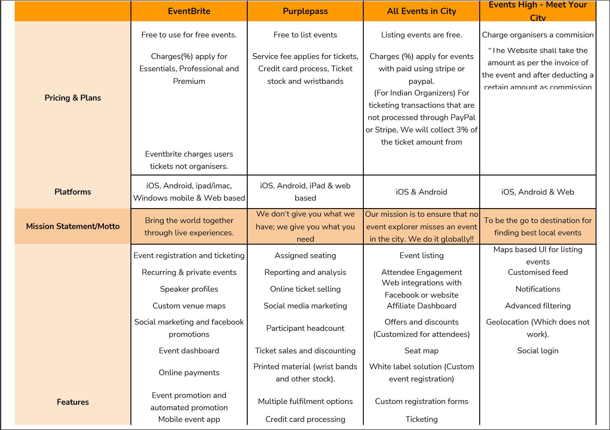
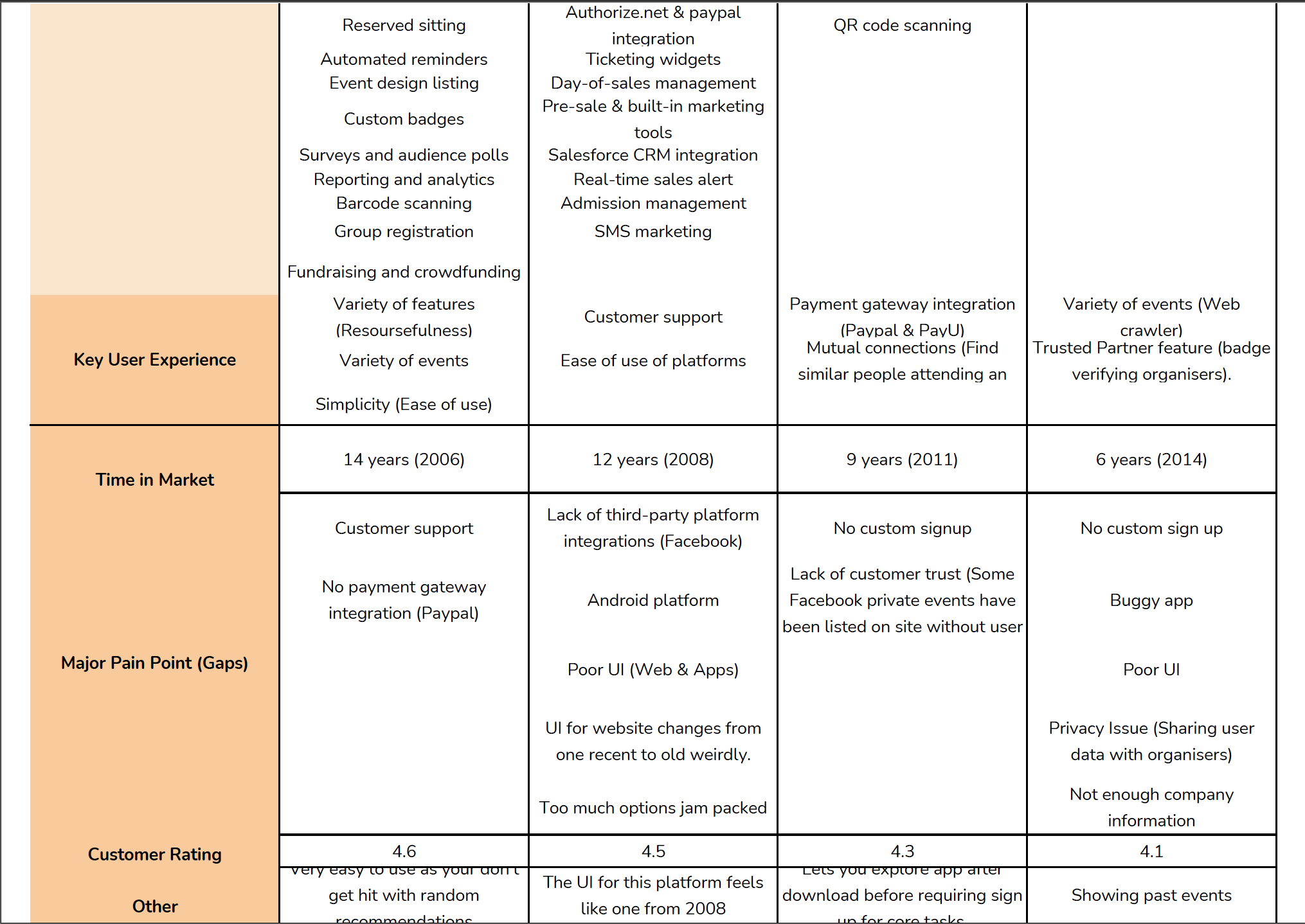
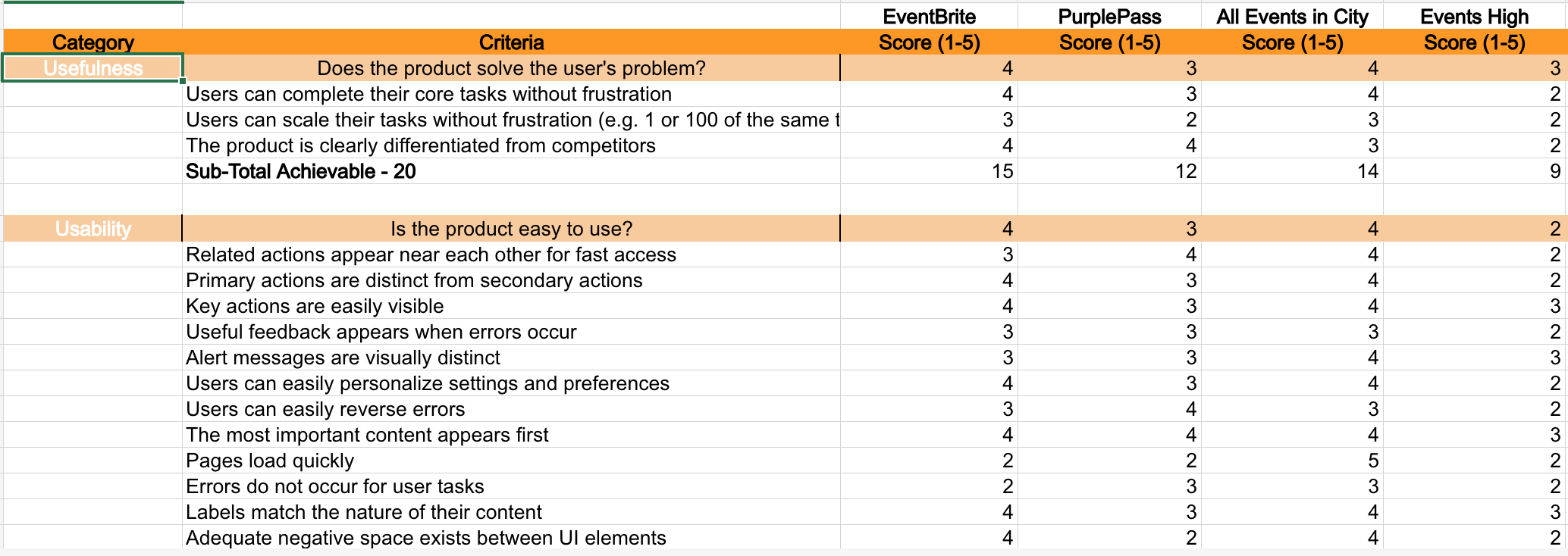
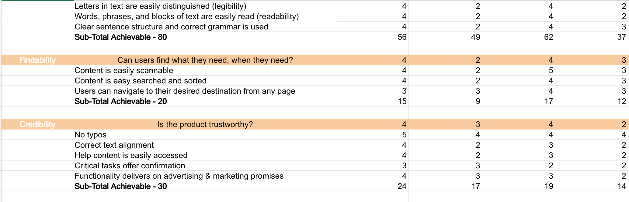
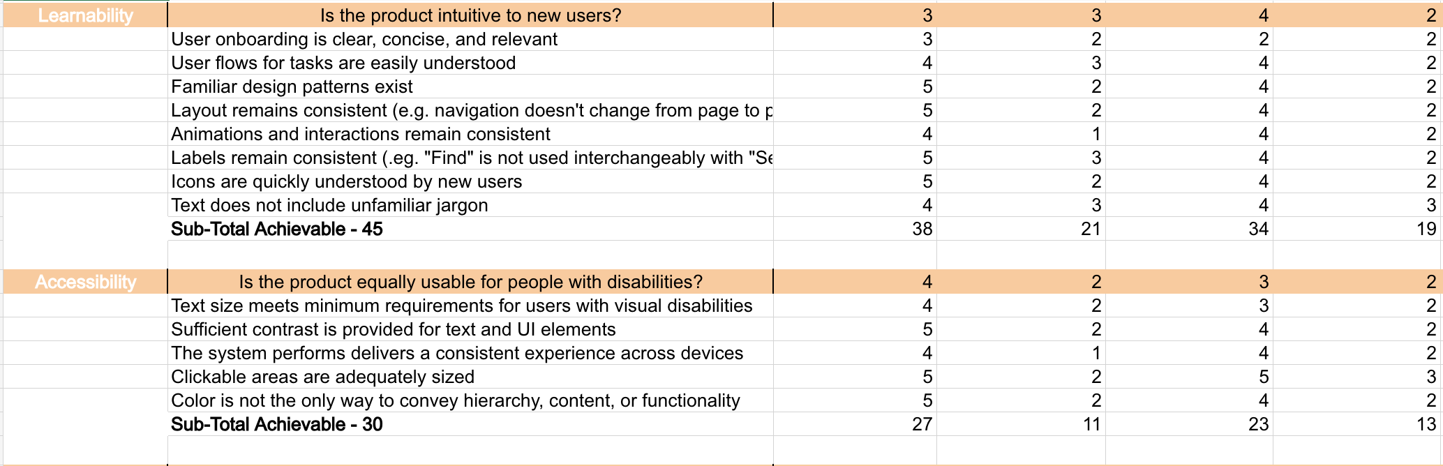
I analyzed 4 top event/discovery platforms to uncover where they succeeded and where gaps existed.
Key Findings & Design Implications
Based on the heuristic and competitive analysis, I identified that while most platforms offered strong individual features, none fully addressed the combined needs of my target users.
Key findings
Most platforms prioritized event volume over personalized discovery
Eventbrite addressed several usability needs but lacked deeper personalization
No single platform aligned fully with user goals identified during research.
- Few apps offered personalized recommendations based on preferences.
- Search-heavy approaches caused friction for casual explorers.
Most platforms had cluttered interfaces with too many options at once.
Design implications
Prioritized curated recommendations over exhaustive listings
Focused on personalization to match user mood, time, and interests
Reduced cognitive load by simplifying navigation and filtering
This analysis justified focusing on a curated recommendation engine and streamlined navigation.
Design Process
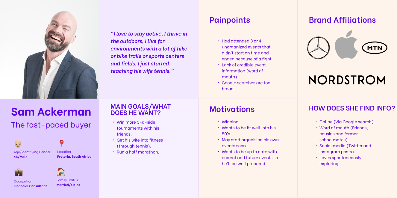
Personas
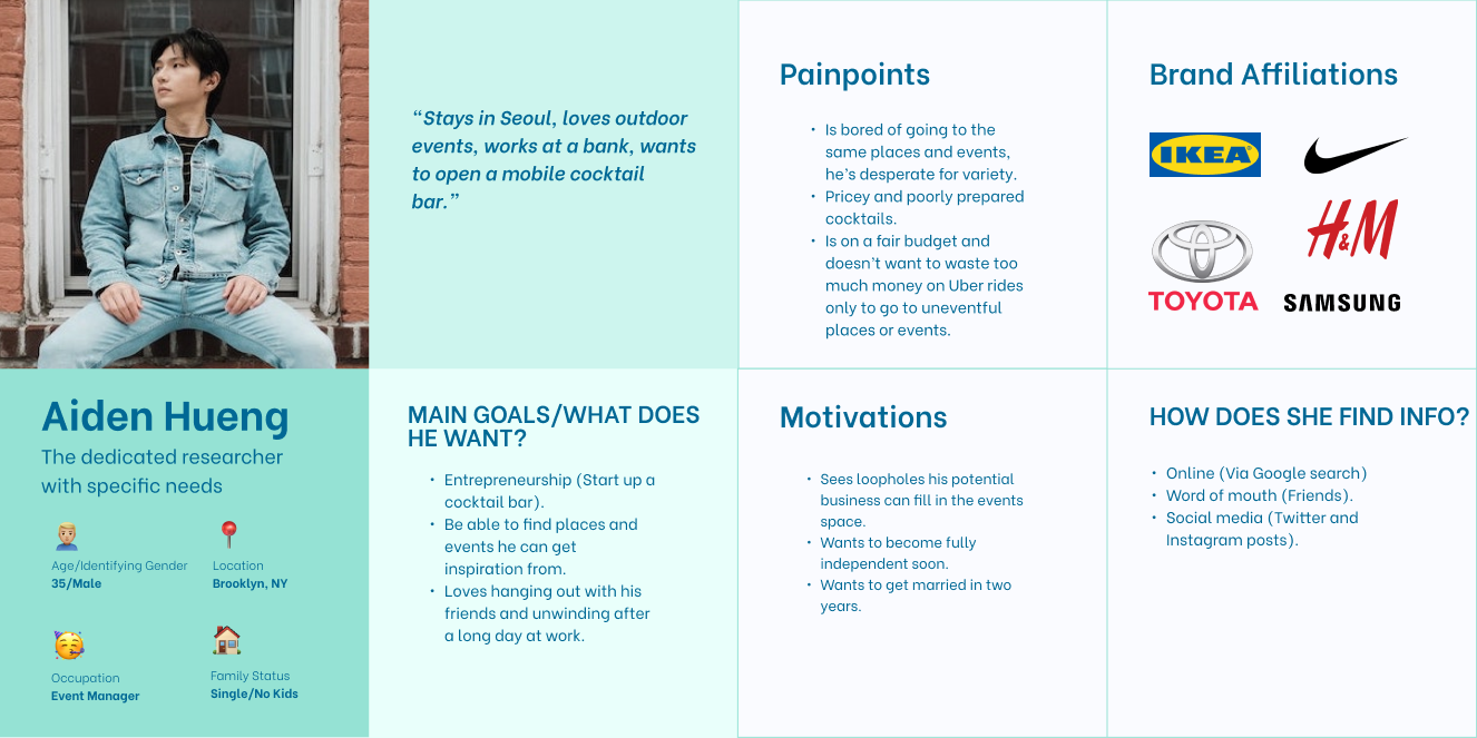
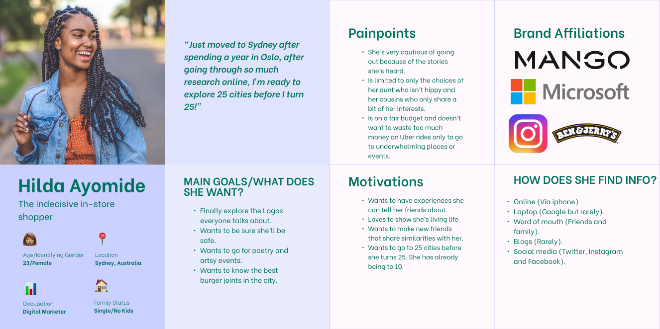
Three personas were developed:
The dedicated researcher with specific needs: Just arrived, wants quick validated suggestions
The Local Enthusiast: An indecisive shopper who knows the city somewhat but wants fresh ideas.
- The Social Space Lover: Thrives in the outdoors, lives for community-integrated activities.
These personas guided feature flows and priority decisions.
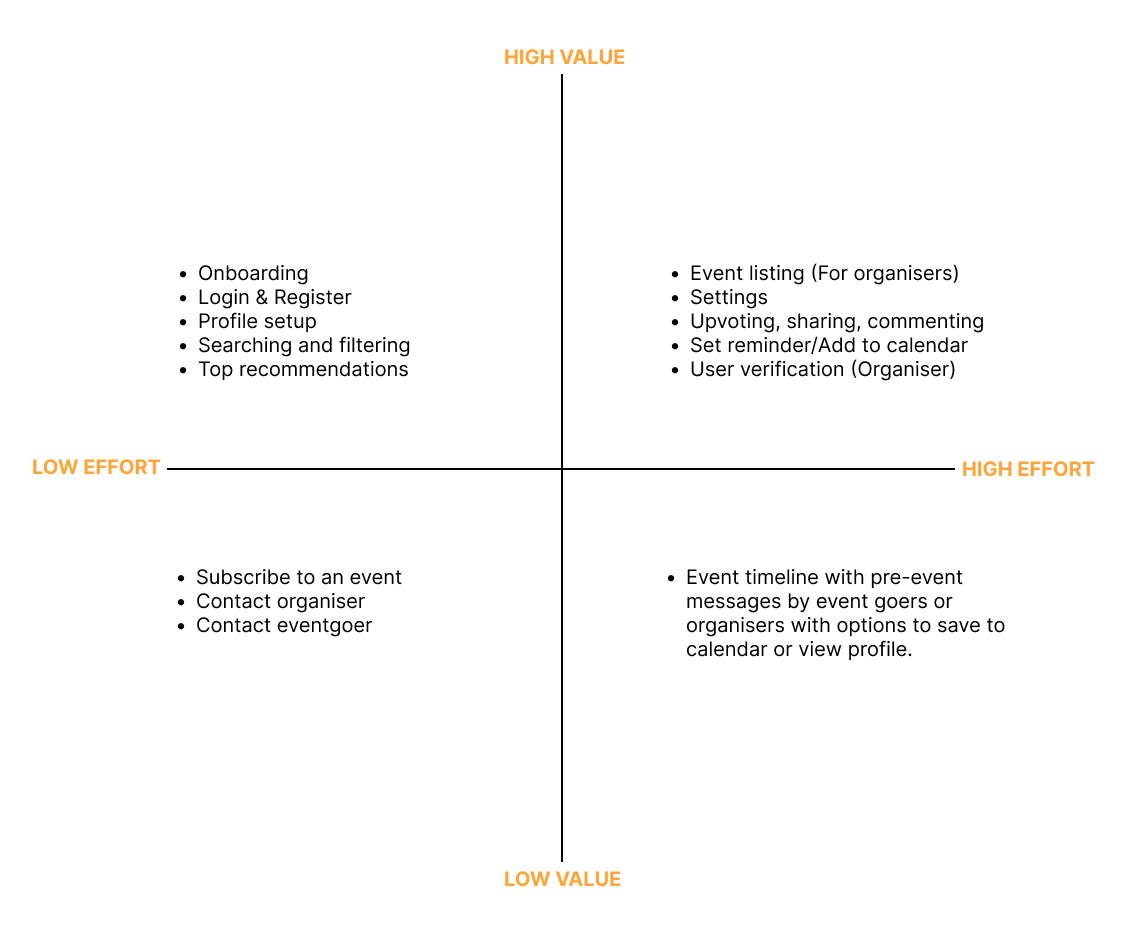
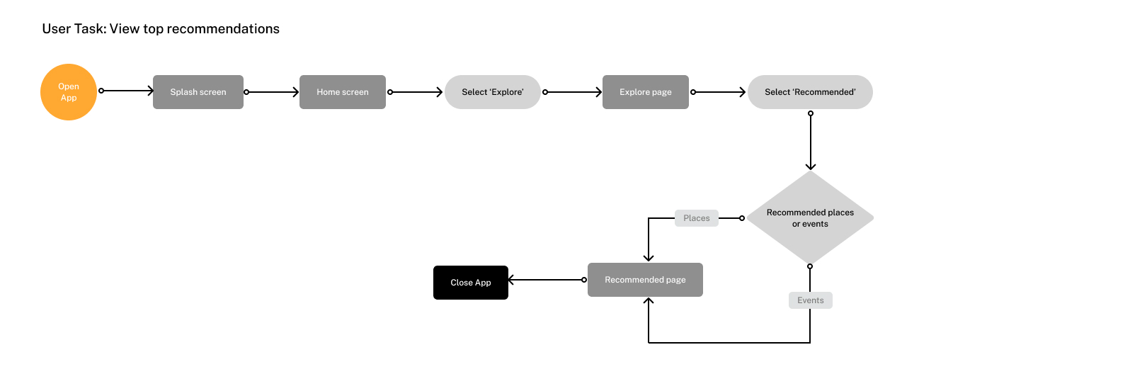
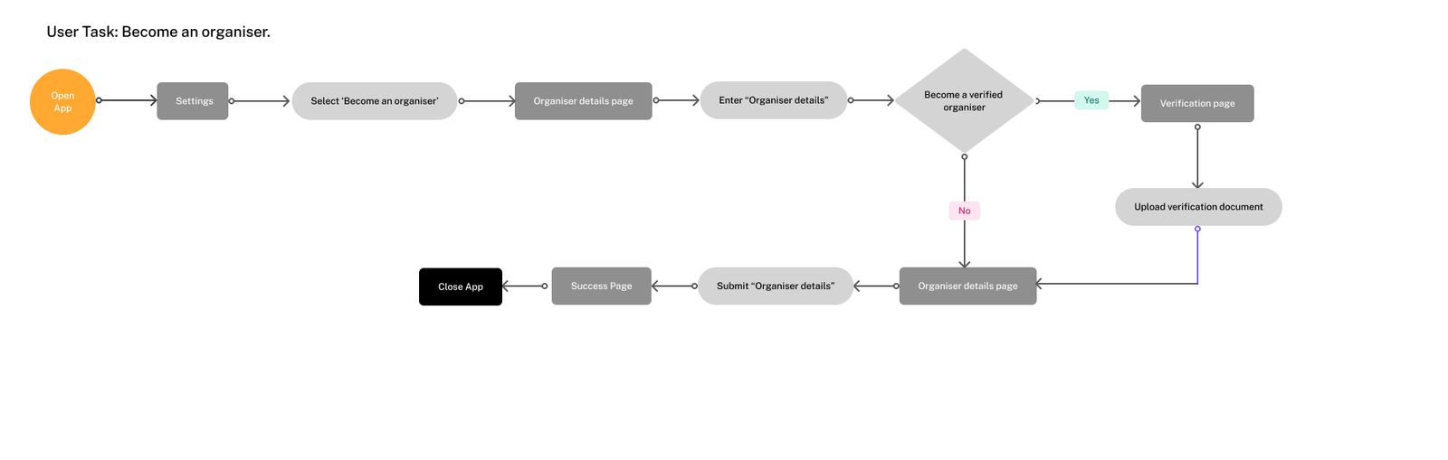
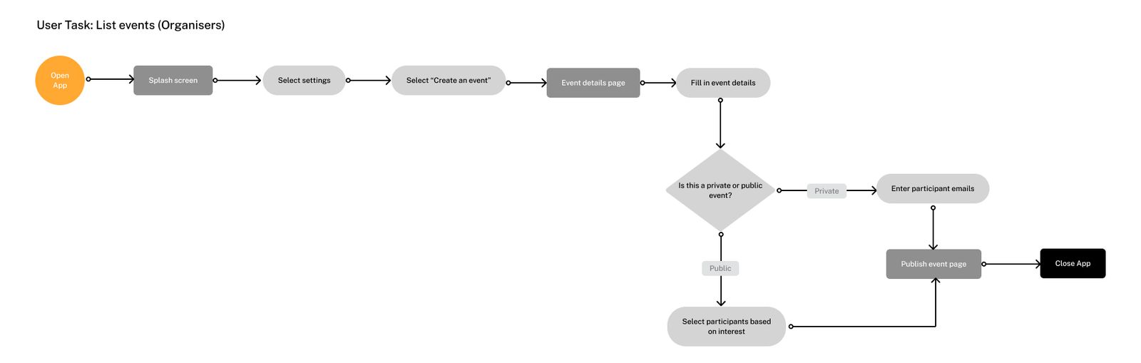
Information Architecture & Task Flow
I mapped key user tasks (discover, filter, save, explore) and translated them into a simplified navigation.
Priority:
Onboarding
Personalized recommendations
Map + category views
Experience details
Task Flow
Wireframes
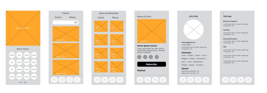
Low-fidelity wireframes helped validate concepts quickly and uncovered onboarding friction early — leading to simplified screens with clearer entry points to discover experiences.
High-Fidelity UI & Prototype
I designed the UI to be clean, visually engaging, and mobile-friendly, emphasizing:
Here’s a Figma link to the high-fidelity mockup and prototype of the app.
Usability Testing & Result
I conducted usability tests using the interactive prototype with 7–8 participants representing target users.
Quantitative Results
85% task completion for discovering an experience, compared to 60% completion in baseline usability testing of competitor apps.
30% faster time to find curated experiences compared to baseline competitor apps.
4.2 / 5.0 average usability satisfaction.
Qualitative Feedback
“I liked how fast I could see recommendations that fit my mood.”
“Navigation felt simple — I didn’t have to guess where to tap next.”
“I wish there were more social validation badges.”
(generic but realistic user responses from usability tests)
Outcome & Learning
CityGong stayed in beta but achieved its design goals within the scope of prototype validation. I learned:
What worked well
Curated recommendations increased engagement vs unfocused search
Persona-driven flows improved clarity
What could improve
Enhanced onboarding could reduce early abandonment
More social proof and trust signals could increase conversion
These insights demonstrate your ability not just to design screens but improve experiences through measurable criteria.
Reflections & Next Steps
If CityGong moved to production:
Conduct deeper A/B testing on onboarding
Introduce personalization based on preferences
Add social sharing and reviews